Browser Start Page - Weekend Project
Published on 16 May 2020 ⸱ 7 min read ⸱ 73 views

The browser is where I start and end my day. Other than office apps, it's the most used tool across my devices. My primary device of choice is a Laptop. Sure, phones are great when I'm on the move, but otherwise it's my laptop - which is 80% of the time.
Firefox has been my browser of choice for most of my life. There was a brief period (2009-2013 - I think), when Google and Chrome was everything for me. Chrome was/is the fastest and cleanest out there. But I started getting uncomfortable with the depth of data Google was gathering about me - in return for providing great products for free. The turning point for me was when Firefox finally launched Quantum in 2017 leapfrogging Firefox' page-loading capability.
Since then, there's been no looking back from Firefox. Another great thing I love about Firefox is the Multi-Account Container Extension. It allows the user to create several containers to open specific websites in specific containers and all data from those websites is stored in those specific containers. Works great to keep Facebook or Google or the scores of other ad tracking platforms from tracking my browser activity.
Anyway, point being - the browser is important to me. And the first thing I see when I open Firefox or Chrome was not quite cutting it for me. It doesn't really suit my needs. It starts off with a search bar - which I don't need when I first launch the browser or open a new tab.
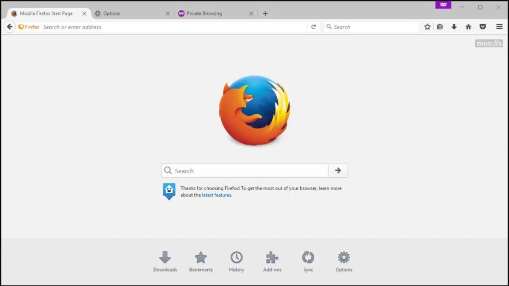
Firefox' standard start page
To suit my browsing workflow, I want my start page to have the following attributes:
- efficient and productive: allowing me to get to where I want within seconds
- easily portable when I move between devices or change devices
- meet my requirements of privacy and security
- easily extensible depending on growing complexity of my requirements
With this in mind, I've tried looking for various "New Tab" Firefox extensions. But the first one I started using was Speed Dial.
Most often, I know which site I want to visit when I open a new tab. I just want to get to it immediately. There are usually a specific set of websites I visit for most things. So then I installed the Speed Dial extension. It allowed me to set a button for each of those websites and just click it when I needed to get to the website. Speed dial was fast and straight-forward.
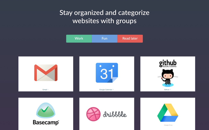
It worked great for my requirements until my requirements started to get complex. Further, when I had to change my laptop there was no real option to switch seamlessly. And lastly, there were negative reviews about the data tracking and storage of this particular extension. I had to switch.
Earlier this year, I stumbled upon r/StartPages while researching for existing start page projects. That subreddit is glorious! So many projects to learn from and work with. I quickly scanned through it all and found a couple of projects that I really liked, suit my requirements and was quick to port for my own requirements.
Enter Tilde Enhanced by Özenç Bilgili whose project is also inspired Cade Scroggins project - Tilde
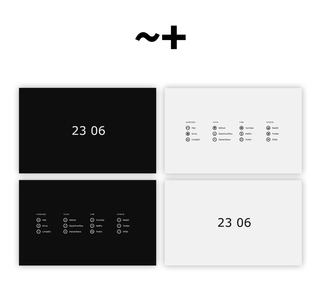
Original Start Page design I mooched
I loved the minimalistic, no fuss approach. Straight to the point. But what's hidden under the hood are the keyboard shortcuts. That's what really makes it so powerful and that's what drew me to use this project.
Simple things like "q!" to quick launch five to six select websites (hardcoded in javascript), "keys!" to switch from viewing icons to shortcut keys. Those shortcut keys are also hardcoded simple keys for example: "r" for reddit.com, "m" for Gmail etc. "?" takes me to the menu of all websites I frequent as per my requirement - again, hardcoded in the Javascript.
The keyboard shortcuts meant I could visit any website within seconds - meeting my first requirement.
Further, this was a self hosted project, hosted on my own server - meeting my second requirement of privacy and security.
Then there's the aspect of potability across all my devices - since it's self-hosted I can take it anywhere. It even works on mobile (responsive is a bitch!).
Lastly - my growing complex requirements. I can scale this start page up or down, add or delete categories, add or delete specific websites, you name it. This start page is totally under my control.
Currently, a version of the Start Page resides at my previous domain for all to view. I've deleted a few categories for privacy purposes.
Obviously, I had an itch to upgrade this start page experience. There were a couple of things I wanted to do immediately: Add a greeting depending on time of day; add the day and date - to remind me what day it is in this lockdown; add the weather of a couple of locations and lastly a global clock.
All these "widgets" can in incremental upgrades as I had to learn how to code them individually - picking up Javascript and CSS along the way. What I didn't anticipate though was how time consuming it would be to make all of this responsive!
Responsive websites are a nightmare! The amount of time things that need to be taken care of. The testing that needs to be done for browsers of various sizes - it was crazy! But I was able to achieve what I envisioned at the start of the project. It took me a couple of weekends really but it's all worth it.
Below are some screenshots of my incremental progress of the project and what it finally looks like.
1st version
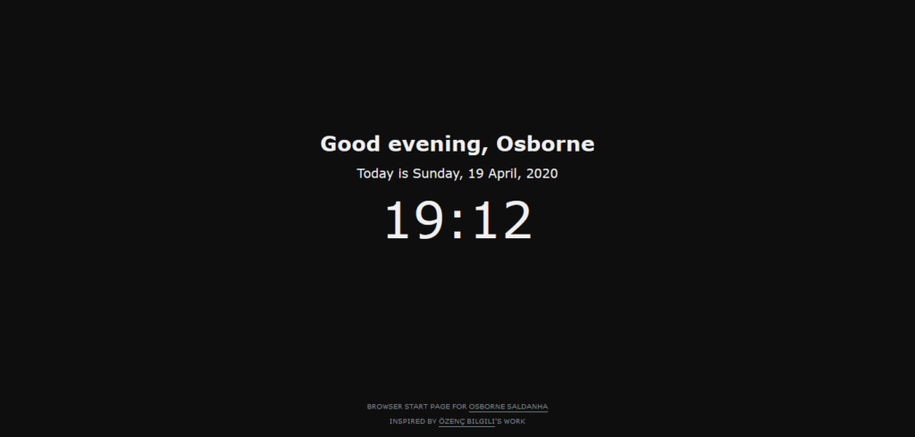
1st version after adding a greeting and the day
2nd version - used the free weather widget provided by WeatherWidget.io and the free stocks widget provided by TradingView
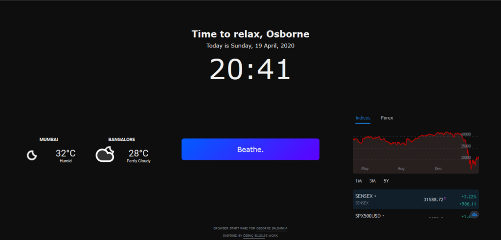
2nd version after adding a small nudge, weather and stocks widget
3rd version - includes a world clock for 6 global cities. This was the trickiest. First was getting a decent widget option that I could customise for my requirement. But was not able to find any. So I've hardcoded the timezones to keep updated at all times based on my device time.
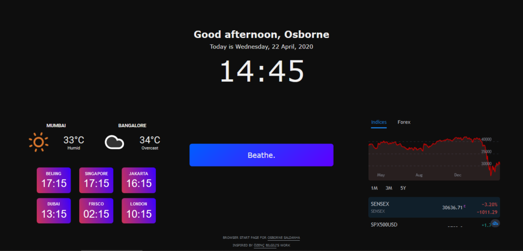
3rd version - includes a world clock for 6 cities that I connect with people from
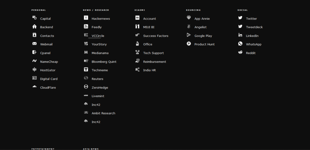
This is what the full list of shortcuts to my frequently visited websites looks like on a laptop (larger screens)
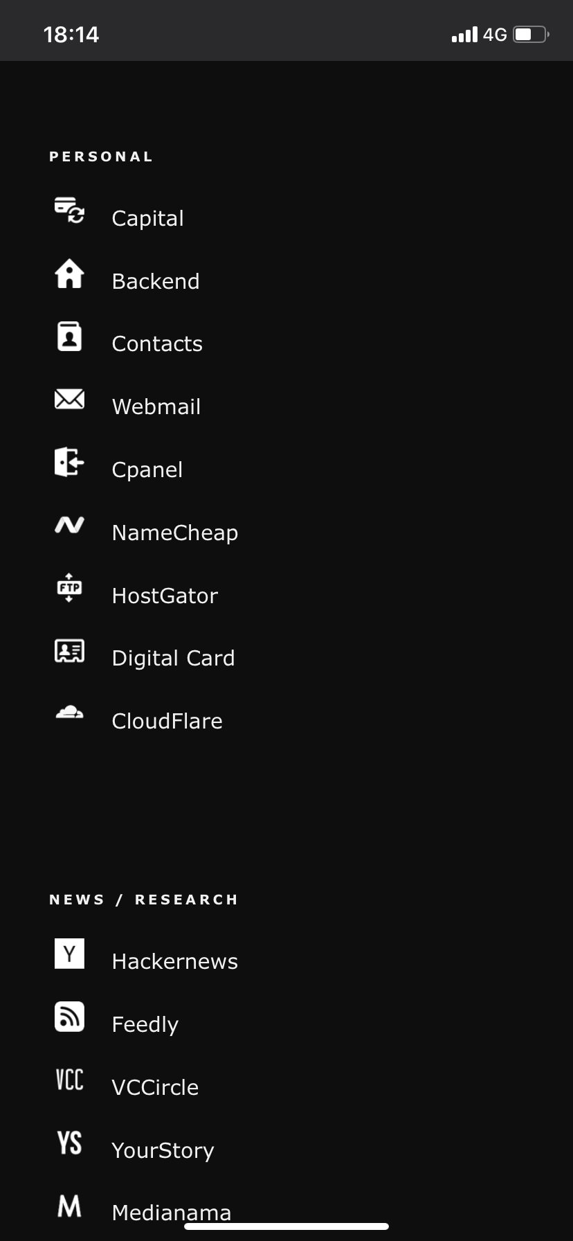
Responsive - an absolute pain because of large number of screen sizes to handle and the number of tests one has to conduct to get it right for each screen size. Below are screenshots from a mobile browser.
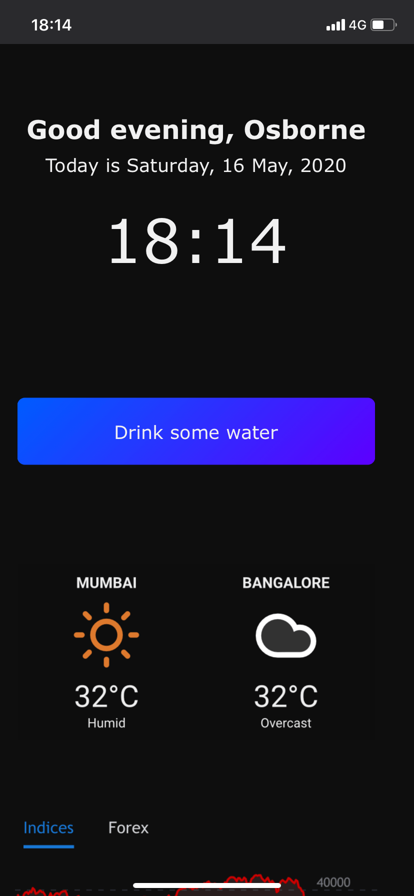
It's been a satisfying Weekend Project that lasted a couple of weekends. Been using it regularly since I've built it (~3-4 weeks). It's a little slow to load - TBH and I need to figure a way to make it snappier. It's probably the external widgets that's slowing it down.
Anyway, that was a fun project and I look to do at least a few more this year.
Let me know what you thought about the project. Any improvements you'd recommend? What does your browser start page look like? Send me a screenshot.
Onward.
Note: All blogs posts till 2022 were migrated to this platform (react+next+tailwind). While all efforts were made to migrate wihtout any loss, the migration lost some images and broke a bunch of links in old posts. If you spot anything amiss, please notify me?